Ultramarine blue, some history of this expensive and stunning colour.
 Nicola Blakemore
Some interesting facts and history about this stunning and expensive blue.
Before the 19th century, Ultramarine Blue pigment was made with lapis lazuli, a luminous blue mineral mined in Afghanistan. The name derives from the Latin ultra (beyond) and mare (the sea), a reference to its remote origins.
Ultramarine Blue’s history
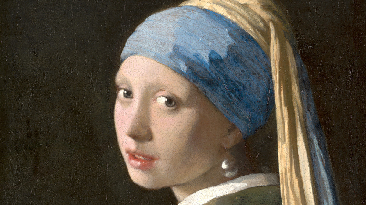
In Renaissance Europe, lapis lazuli was immensely expensive thanks to its rarity and the time-intensive process of grinding the mineral into paint. The yield was small, with 1kg of mineral producing around only 30g of pigment. As a result, it was used sparingly, usually reserved for the robes of the Virgin Mary and other holy figures. The colour came to symbolise humility and purity, as well as signifying the wealth of the patron who commissioned its use. An artist would often charge for the pigment separately on the invoice so that the patron could choose how much ultramarine they wanted to pay for. In the 17th Century, Dutch artist Johannes Vermeer used the pigment extensively in almost all of his paintings. The turban of the Girl With a Pearl Earring is painted with Ultramarine and Lead White and finished with a glaze of pure Ultramarine.
The Development of Synthetic Ultramarine
In 1826, a synthetic version of Ultramarine was developed by French chemist Jean-Baptiste Guimet by heating kaolinite, sodium carbonate and sulfur in a kiln to create a pigment which is chemically identical to lapis lazuli, but even more vivid in colour. In order to differentiate it from its mineral counterpart, it was called French Ultramarine. Due to its affordability and effectiveness as a lapis lazuli alternative, French Ultramarine quickly became more prevalent than the original mineral pigment and is now considered an essential colour in an artist’s palette. Genuine lapis lazuli paints are still produced, but they are no longer labelled as Ultramarine. Compared with the synthetic pigment, lapis lazuli is a more muted colour, and it is weaker in coverage and tinting strength.
Ultramarine’s Mixing Qualities
Synthetic Ultramarine Blue is usually a warm, reddish-blue, but there are variations of Ultramarine and some professional brands have more than one in their range. Sometimes they are differentiated as being either ‘green-shade’ or ‘red-shade’ to indicate the colour bias. The difference between these varieties may seem subtle, but whether a blue leans towards red or green is imperative in colour mixing. In watercolour, Schmincke and Daniel Smith offer both Ultramarine Blue and French Ultramarine. In both ranges, French Ultramarine is slightly warmer (redder) and more granulating, whereas Ultramarine Blue is cooler (greener) and less granulating. Additionally, Schmincke have an Ultramarine Finest which is non-granulating due to it’s small, finely milled pigment particles.
While it is transparent to semi-transparent, Ultramarine Blue has a high tinting strength which means that it holds its own in mixes without being overpowering. It can be mixed with Burnt Sienna or Burnt Umber to create subtle neutral tints. Combined with a bluey-red like Permanent Rose, Ultramarine Blue can make vibrant violets.
Categories: : All about paint